

For this project first an overview of all controls is given, each with the information of how to create it. After that the details per package are provided.
GUI Controls
Layouts
HBox
creation: componentFactoryFx.createHBox()
VBox
creation: componentFactoryFx.createVBox()
GridPane
creation: componentFactoryFx.createGridPan()
Simple Controls
Label: TODO
Menus
MenuBar
creation: componentFactoryFx.createMenuBar()
Menu
creation: componentFactoryFx.createMenu()
Dialogs
For all dialogs, customized versions of javafx.scene.control.Alert are used.
As for all GUI controls, these are created via the ComponentFactoryFx.
The dialogs with a specific kind of information (Error, Exception, Warning, Information) have an icon to identify this kind of information, therefore the graphic of these dialogs cannot be specified.
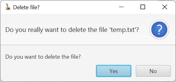
Error dialog
This dialog is shown in case of an error.
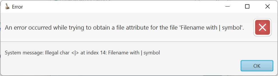
Contents of this dialog:
- Title bar with:
- Application icon
- Title, being ‘Error’.
- Header text and ‘error icon’.
The header text describes what went wrong. - Content text and ‘OK’ button.
The content text provides additional details, often the system error message.
creation: componentFactoryFx.createErrorDialog(String headerText, String contentText)
Exception dialog
This dialog is shown to report an exception.
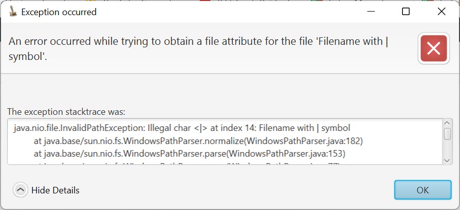
Contents of this dialog:
- Title bar with:
- Application icon
- Title, being ‘Exception occurred’.
- Header text and ‘error icon’.
The header text describes what went wrong. - Content text and ‘OK’ button.
The content text shows the exception stacktrace.
creation: componentFactoryFx.createExceptionDialog(String headerText, Exception exception)
Warning dialog
This dialog is shown to report a warning.
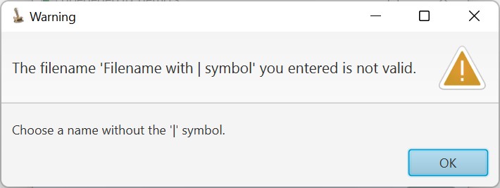
Contents of this dialog:
- Title bar with:
- Application icon
- Title, being ‘Warning’.
- Header text and ‘warning icon’.
The header text describes what is not ok. - Content text and ‘OK’ button.
The content text describes the proposed solution.
creation: componentFactoryFx.createWarningDialog(String headerText, String contentText)
Information dialog
This dialog is shown to inform the user about something.
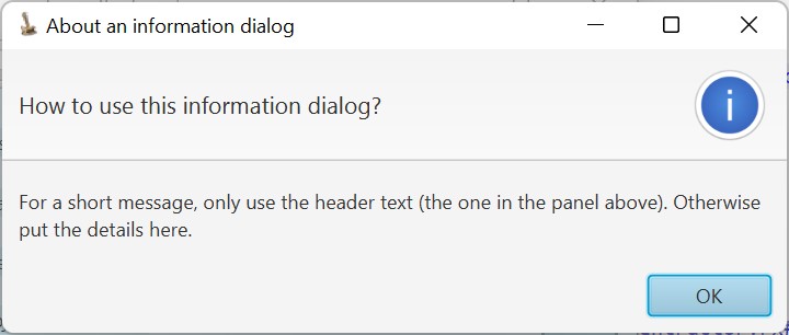
Contents of this dialog:
- Title bar with:
- Application icon
- Title, as specified
- Header text and ‘information icon’.
The header text is a short text. - Content text and ‘OK’ button.
The content text is to provide more details.
For a short message, only use the header text. Otherwise, the header text shall provide a short description and the context text shall provide more details.
creation: componentFactoryFx.createInformationDialog(String title, String headerText, String contentText)
Application information dialog
This dialog is shown to inform the user about something, using a specific graphic.
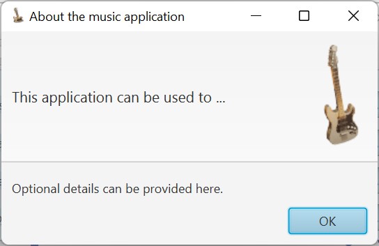
Contents of this dialog:
- Title bar with:
- Application icon
- Title, as specified
- Header text and an icon as specified.
The header text is a short text. - Content text and ‘OK’ button.
The content text is to provide more details.
For short information, only use the header text. Otherwise, the header text shall provide a short description and the context text shall provide more details.
creation: componentFactoryFx.createApplicationInformationDialog(String title, Image image, String headerText, String contentText)
Application information dialogs with formatted text
These dialogs are typically used to show larger informational texts.
There are two versions available:
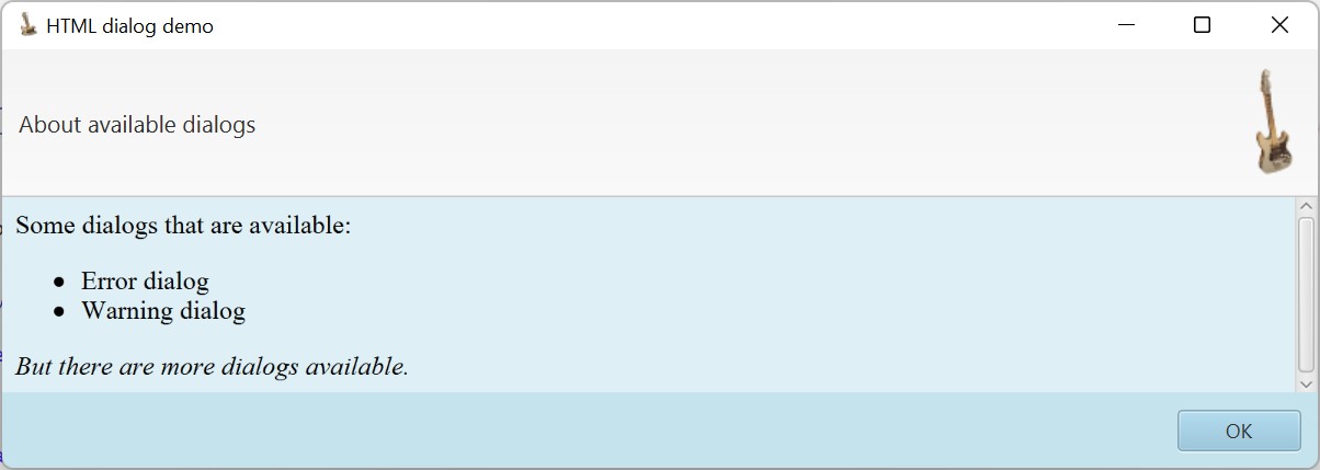
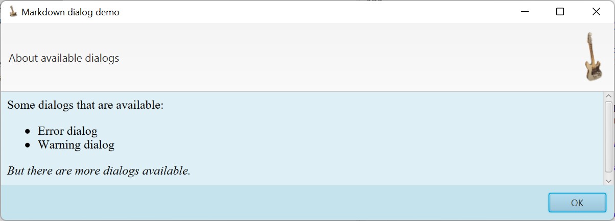
The only difference between these two dialogs is how the formatted text is specified; as HTML or markdown.
Contents of this dialog:
- Title bar with:
- Application icon
- Title, as specified
- Header text and an icon as specified.
The header text is a short text. - Content text
The formatted specified text (specified in HTML or markdown format) - ‘OK’ button.
For short information, only use the header text. Otherwise, the header text shall provide a short description and the context text shall provide more details.
creation:componentFactoryFx.createMarkdownTextDialog(String title, Image image, String headerText, String contentText)
componentFactoryFx.createHtmlTextDialog(String title, Image image, String headerText, String contentText)
Confirmation dialogs
These dialogs are shown to let the user accept or reject a proposal. There are two versions, so you can chose the one which best fits to the question asked.
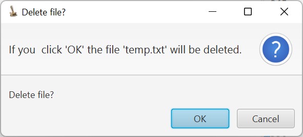
Contents of these dialogs:
- Title bar with:
- Application icon
- Title, as specified
- Header text and ‘question icon’.
The header text is descriptive version of the question. - ‘OK’ and ‘Cancel’ buttons, or ‘Yes’ and ‘No’ buttons and content text.
The content text repeat the question in a short format.
creation:componentFactoryFx.createOkCancelConfirmationDialog(String title, String headerText, String contentText)componentFactoryFx.createYesNoConfirmationDialog(String title, String headerText, String contentText)
Choise dialog
This dialog lets the user choose one of a list of options. The options are presented in a combo box.
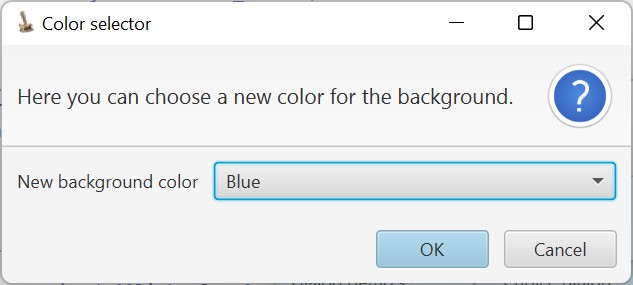
Contents of this dialog:
- Title bar with:
- Application icon
- Title, as specified
- Header text and ‘question icon’.
The header text shall describe what is to be chosen. - Combo box with an optional short text, options (in a combo box) and ‘OK’ and ‘Cancel’ buttons.
This dialog is created via:public Alert createChoiceDialog(String title, Image image, String headerText, String contentText)
Information per package
package goedegep.jfx
This package provides customized JavaFx classes. The classes can be provided as follows:
- Via the factory
ComponentFactoryFx
This factory provides methods to get customized instances of the plain JavaFx classes. - As customized classes which extend the JavaFx classes
This is needed so other classes can further extend these classes. These classes are named ‘JavaFx<JavaFxClass>’ (e.g.JavaFxStageprovides a customized version ofjavafx.stage.Stage).
class CustomizationsFx
A helper class to store the Customization per module and access them by their module name.
package goedegep.jfx.eobjecttreeview
This package provides a TreeView for a hierarchical EObject. The main features are:
- EObjectTreeView extends javafx.scene.control.TreeView
So all functionality of the JavaFx TreeView is available. - Customization of which parts are shown and how
The tree view is highly customizable. However this can also be completely omitted.
In this case all information is derived from the EObjects. - GUI customization
By default the customization is obtained viaDefaultCustomizationFx.getInstance(). But you can set the customization by specifying aCustomizationFx. - View mode/Edit mode
When you are browsing through the tree view, you don’t want to see all the attributes for which no value is provided. Therefore two different modes of operation are defined.
The tree view is either in ‘view mode’ or in ‘edit mode’. In ‘view mode’ attributes which have no value are not shown and the items cannot be changed,
in ‘edit mode’ all attributes are shown (unless the Descriptor specifies that there aren’t to be shown) and the items can be changed. - ObjectSelector
The tree view implements theObjectSelectorinterface. This normally provides an object of a specific type. A tree however contains items of different types.
This also means that some context information is required. ThereforeobjectSelected()provides the selected tree item (instead of the value).
It should be noted that from the tree item you can easily get its value, but the other way around is not easy and in case of simple values not possible. - Drag and Drop support
Via Drag and Drop EObjects can be moved within the tree. An EObject can of course only be moved to a location which supports the type of the item to be moved.
The move is a real move, meaning that the object is really moved (instead of creating a clone of the object and then deleting the object).
Apart from this standard functionality, it is possible to set functions to check whether a drop is possible and to handle the drop. - Searching
You can search for items in the tree containing a specific text.
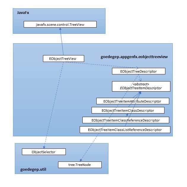
The package contains quite some classes and interfaces, which can be grouped as follows:
- The tree view itself
The main class of the tree isEObjectTreeView, which extendsjavafx.scene.control.TreeView. This class only provides some common functionality. - Tree items
The tree exists of tree items (often also referred to as tree nodes), which have to extendjavafx.scene.control.TreeItem. Abstract classEObjectTreeItemprovides the common funtionality and extendsTreeItem. The following classes all extendEObjectTreeItemfor the specific types of items in the tree:EObjectTreeItemForAttributeList,EObjectTreeItemForAttributeListValue,EObjectTreeItemForAttributeSimple,EObjectTreeItemForObjectandEObjectTreeItemForObjectList. - Tree cells
The tree cells perform the presentation of the tree items.
EObjectTreeCell
EObjectTreeCellHelper
EObjectTreeCellHelperTemplate
EObjectTreeCellHelperForAttributeAbstract
EObjectTreeCellHelperForAttributeBoolean
EObjectTreeCellHelperForAttributeEnumeration
EObjectTreeCellHelperForAttributeFile
EObjectTreeCellHelperForAttributeFolder
EObjectTreeCellHelperForAttributeList
EObjectTreeCellHelperForAttributeListValue
EObjectTreeCellHelperForAttributeMultiLineText
EObjectTreeCellHelperForAttributeSimple
EObjectTreeCellHelperForObject
EObjectTreeCellHelperForObjectList - Presentation
With these classes the tree cells can be tailored.
EnumStringConverterAndChecker
PresentationType
EObjectTreeItemDescriptor
EObjectTreeItemAttributeDescriptor
EObjectTreeItemAttributeListDescriptor
EObjectTreeItemAttributeListValueDescriptor
EObjectTreeItemClassDescriptor
EObjectTreeItemClassListReferenceDescriptor
EObjectTreeItemClassReferenceDescriptor - Node Operations
The classes provide information for the context menus of the tree cells.
NodeOperationDescriptor
NodeOperationDescriptorCustom
NodeOperationDescriptorDelete
NodeOperationDescriptorNew
NodeOperationDescriptorNewAbstract
NodeOperationDescriptorNewAfter
NodeOperationDescriptorNewBefore
NodeOperationDescriptorOpen
Class EObjectTreeView
This is the main class of the tree view. It provides the following functionality:
- Customization
The methodsetCustomization(CustomizationFx customization)provides customization. This only sets the background color of the tree view.
By default the DefaultCustomization is used. - Edit mode/view mode
This can be set with the methodsetEditMode(boolean editMode). This method just callssetEditMode(boolean editMode)on the root item of the tree. Each tree item then calls the same method on its children. - Setting the cell factory
The cell factory is set to creating anEObjectTreeCell. ObjectSelectorimplementation
The tree view implements thegoedegep.util.objectselector.ObjectSelectorinterface. So it listens to changes in the selected tree item and informs any listener about any changes.EClassandEAttributepresentation information
ForEClassesEObjectTreeItemClassDescriptors can be added via the methodaddEClassDescriptor(EClass eClass, EObjectTreeItemClassDescriptor eObjectTreeItemClassDescriptor).
These descriptors provide information of what shall be shown of theEClassand how. For each structural feature to be shown it contains anEObjectTreeItemDescriptor.
Two methods are provided to obtain the (best) descriptor for anEClassand there is a method to obtain the descriptor for a descriptor for an attribute of anEClass:getDescriptorForEClass(EClass eClass, boolean createIfNotExisting)
This method returns the descriptor for the specifiedEClass. If no such descriptor exists andcreateIfNotExistingis set, a default descriptor for the class is created. This default constructor is built using all structural features of theEClass.getBestDescriptorForEClass(EClass eClass, boolean createIfNotExisting)
If an item in the tree can be of a specific class, the item can also be a subclass of this class. So this method first tries find a descriptor for the specifiedEClassand if not found it tries to find one for the parent class (and so on). If in the end no descriptor is found andcreateIfNotExistingis set, again a default descriptor is created.- getEObjectTreeItemAttributeDescriptor(EClass eClass, EAttribute eAttribute)
This method returns the descriptor for the specifiedEAttributein the specifiedEClass.
Enumpresentation information
ForEnumsEnumStringConverterAndCheckers can be added via the method addEnumStringConverterAndChecker(Class<? extends Enum<?>> enumClass, EnumStringConverterAndChecker<?> enumStringConverterAndChecker).
These converters provide methods to convert to and fromString, but also provide a list of all names for the enum constants. This is typically used to provide the items of a combo box.
The methodgetEnumStringConverterAndChecker(Class> enumClass)is provided to obtain the converter for a specific enum class. If this doesn’t exist yet, a default converter is created.- Drag and Drop
AnEObjectTreeViewautomatically supports drag and drop within the tree. AnyEObjectcan be moved to a location which supports the type of the item to be moved (and only in lists of objects). The move is a real move, meaning that the object is really moved (instead of creating a clone of the object and then deleting the object).
For other drag and drop functionality methods can be set on this class. Two methods of typeBiPredicate<EObjectTreeItem, Dragboard>have to be provided via the methodssetIsDropPossibleFunctionandsetHandleDropFunction. These methods are only set at tree level, so the implementations have to check the type of tree item.
The drag and drop functionality itself is implemented by the tree items, so it is further discussed there. - Searching
Searching is done on the data and not based on the tree items or tree cells. Therefore it is implemented here.
A search text can be set viasetSearchText(String searchText). - List icon
There is a method to obtain theImagefor the list icon:getListIcon().
The method is here because two tree cell helpers use it. - Setting the
EObject
The EObject to be shown is set via the methodsetEObject(EObject eObject).
At this level the work to be done is quite simple:- Stop listening for changes on any previous
EObjectset and start listening for changes on the newEObject. - Create the root tree item and set this as the new root.
All other work is done by the tree items.
- Stop listening for changes on any previous
- Finding and selecting tree items
Methods are provided to find or select specific items in the tree.
Tree items
Tree items have to provide the following:
- isLeaf()
Has to return true if the item has no children, false otherwise. - Editable
The startEdit() method of a TreeCell has to check whether the item is editable or not. So the item has to provide this information. - Children
- getChildren()
Always has to return the actual list of children. - When the underlying data changes, children may have to be added, removed or reordered.
- Upon switching from view mode to edit mode, children may be added. Upon switching from edit mode to view mode, children may be removed.
- getChildren()
The tree items are implemented by an abstract class EObjectTreeItem and subclasses for the different parts of an EObject:
EObjectTreeItemForObject
This tree item shows an icon and a text, which are both configurable via the class descriptor. The text is usually derived from the reference to this object. For example aPersonhas anAddress, the text could be ‘address’. If you have aShipmentto anAddressit could be ‘shipment address’.
It is also possible that the text is a description of the object. This is often the case if the object is part of a list of objects (a reference of type multiple).
The children are based on the structural features of the object, described by the class descriptor.EObjectTreeItemForObjectList
This tree item shows an icon and a text, which are both configurable via the class descriptor. The text is usually derived from the reference to this object. For example if aCompanyhas employees of typePerson, the text could be ’employees’.
The children are the objects in the list (tree items of typeEObjectTreeItemForObject).EObjectTreeItemForAttributeSimple
This tree item typically shows a label, derived from the attribute name, and the attribute value.
There are no children.EObjectTreeItemForAttributeList
What is shown is similar to what is shown for anEObjectTreeItemForObjectList.
There is a child item (typeEObjectTreeItemForAttributeListValue) for each value in the list.EObjectTreeItemForAttributeListValue
This tree item typically only shows a value.
There are no children.
The provided functionality is now described per topic.
Children
The EObjectTreeView creates the root node.
isLeaf()
This method is abstract in EObjectTreeItem, so each sub class has to implement it.
EObjectTreeItemForObject
The item is a leaf if it has no structural features to be displayed for theEObject. This is the case if the descriptor has no features to be displayed, or if the tree is in view mode and all features to be displayed are null.EObjectTreeItemForObjectList
The item is a leaf if the list is empty.EObjectTreeItemForAttributeSimple
A simple attribute value is always a leaf..EObjectTreeItemForAttributeList
The item is a leaf if there is no list, or if the list is empty.EObjectTreeItemForAttributeListValue
A list value is always a leaf.
Editable
Key method here is startEdit() in the tree cell, in our case in EObjectTreeCell.
If the tree is in view mode, the whole tree is set to not editable. This is done in the EObjectTreeView, by calling setEditable() on the tree view. And if the tree is not editable, startEdit() is never called. So no check for the tree being in edit mode is needed here.
Method startEdit() in EObjectTreeCell calls isEditable() on the tree item. The sub classes implement this as follows:
EObjectTreeItemForObject– not editable
An object itself is not editable, it’s attributes are editable.EObjectTreeItemForObjectList– not editable
You cannot edit a list of objects. Instead functionality has to be provided to e.g. add objects to the list, remove objects from the list or move objects within the list.
This is provided via context menus and drag and drop functionality.EObjectTreeItemForAttributeSimple– editable.EObjectTreeItemForAttributeList– not editable
You cannot edit a list of attribute values. Instead functionality has to be provided to e.g. add values to the list, remove values from the list or move values within the list.EObjectTreeItemForAttributeListValue– editable
But there is more: Drag and Drop and context menu items may also change (edit) values.
Drag and Drop fully has to be disabled in view mode.
In the context menus all items are disabled which may lead to changes.
Descriptors
Overview of the classes:
EObjectTreeCellHelperTemplate<D extends EObjectTreeItemDescriptor>The implementation of the tree cell helpers is based on the Template pattern and this is the template class.EObjectTreeCellHelperForAttributeList
This class is a tree cell helper for the ‘list’ node of an attribute of type many.EObjectTreeCellHelperForAttributeListValue
This class is a tree cell helper for a single value of an attribute of type many.EObjectTreeCellHelperForAttributeSimple
This class is a tree cell helper for a simple attribute.EObjectTreeCellHelperForObject
This class is a tree cell helper for an object.EObjectTreeCellHelperForObjectList
This class is a tree cell helper for a list of objects.- EObjectTreeItemDescriptor
This class forms the common part for descriptors for an item in an EObjectTreeView. - EObjectTreeItemAttributeDescriptor
This class is an EObjectTreeItemDescriptor for an item of type EObjectTreeItemType.ATTRIBUTE_SIMPLE. - EObjectTreeItemAttributeListDescriptor
This class is an EObjectTreeItemDescriptor for an item of type EObjectTreeItemType.ATTRIBUTE_LIST. - EObjectTreeItemAttributeListValueDescriptor
This class is an EObjectTreeItemDescriptor for an item of type EObjectTreeItemType.ATTRIBUTE_LIST_VALUE. - EObjectTreeItemClassDescriptor
This class is an EObjectTreeItemDescriptor for an item of type EObjectTreeItemType.OBJECT. - EObjectTreeItemClassListReferenceDescriptor
This class is an EReference specific descriptor for an item in an EObjectTreeView. - EObjectTreeItemClassReferenceDescriptor
This class is an EObjectTreeItemDescriptor for an item of type EObjectTreeItemType.CLASS_REFERENCE. - NodeOperationDescriptor
This class describes the available operations for an item in a tree. - ExtendedNodeOperationDescriptor
- EObjectTreeItem
This class represents EObject tree items. - EObjectTreeItemContent
This class contains all data needed to be stored in a tree item. - EEnumEditorDescriptor
This class is a descriptor for an EEnum editor. - EObjectTreeItemType
This enumeration defines the types of the items in an EObjectTreeView. - PresentationType
This enumeration type specifies the ways (String) values can be presented.
Tree items
A TreeView consists of items of type TreeItem. The items in the tree have to contain all relevant information. In this case:
- The value of the item
- The type of information stored in the item
This is used to select the right tree cell helper. - The EStructuralFeature represented by this item.
Needed to change the value. - Presentation information (the presentationDescriptor)
- A reference back to the tree view.
Tree structure
The structure of the tree is as follows.
The root node is an OBJECT node for the EObject to be shown.
An OBJECT node has the following content:
- object = the eObject
- eStructuralFeature = null
- presentationDescriptorTreeNode = the corresponding descriptor
An OBJECT node has one child for each EStructuralFeature of the eObject, which is either an EAttribute or an EReference.
Tree cell helpers
A TreeCell is used to render an item in a TreeView. Although the rendering largely depends on the type of the item, there is only a single type of TreeCell, which is created by a factory set via setCellFactory(). Here the TreeCell is of type EObjectTreeCell which itself is a TreeCell<EObjectTreeItemContent>.
To avoid that EObjectTreeCell gets very complex, we use tree cell helpers to do the type specific work. These helpers all implement the EObjectTreeCellHelper interface.
The common part is implemented by EObjectTreeCellHelperAbstract, which is a generic type with a subtype of EObjectTreeItemDescriptor as parameter.
For each type defined by EObjectTreeItemType there is a subtype of EObjectTreeCellHelperAbstract.
A TreeCell instance is also reused to render different items. Each time the TreeCell instance is assigned to an item, the method updateItem is called. Therefore this method creates the right helper for the item type and then delegates the work to the helper by calling updateItem on the helper.
How it works together
The root of the tree is always an EObject (EClass).
package goedegep.jfx.objectcontrols
This package provides a set of GUI controls to show and enter object values.
JavaFx controls don’t all operate on an object. For example, if you use a TextField to show or enter a date, you have to do the conversion from date to String yourself.
If you are building an editor, you have to know whether a value has been entered and if this value is valid.
The ObjectControls in this package try to solve this. They are all JavaFx controls wrapped as anObjectControl.
What has to be supported by an ObjectControl?
- Consistent presentation of information
Example: your application shows dates as dd-mm-yyyy, but the user can enter the date as d-m-yyyy. Then when the user goes to the next field in the editor, the entered date should be reformatted to the dd-mm-yyyy format.
Therefore, when a control loses focus, it has to redraw the value.
Implementation details
Use JavaFx beans properties as much as possible for the properties optional, filled in and valid. TODO not valid anymore
interface goedegep.jfx.objectcontrols.ObjectControl
GUI controls, like TextField, represent the value of an object, but the control itself is unaware of the object type.Therefore a set of controls is defined which are object type aware.
For example, if you want to show a LocalDate as text and allow the user to edit this value:
•To show the LocalDate, it has to be formatted to a String.
In this interface this is taken care of by the method setValue, where the formatting is to be done by the implementing class.
•The other way around is even more complicated.
To use the text from the TextField to set a LocalDate, you first have to parse the text to create a LocalDate.In this interface this is taken care of by the method getValue, where the parsing is to be done by the implementing class.
But there is more, you want to know whether the user has to enter a value, has entered a value and whether the value is valid. This is discussed below.
Optional
An edit window typically has several controls. A ‘save’ button is often only enabled if all required values are filled in.The isOptional method can be used to check on this. An implementing class typically provides a constructor with an ‘isOptional’ parameter.
Filled in
Indicates that something is entered, it may be valid or not. The isFilledIn method can be used to check on this.
Valid
An edit window typically has several controls. A ‘save’ button is often only enabled if all required values are valid.
Valid is defined as: •Either: the control is optional and nothing is filled in
•
•Or: What is filled in can be translated to an object of the type of the control.
The isValid method can be used to check on this.
- React to changes
- Edit objects (not just Strings)
A JavaFx TextField provides the functionality to edit Strings. To edit e.g. a Date you have to convert the date to text and after editing you have to convert it back from text to a Date.
Note: It would be more logicl if ObjectControl would extend ObservableValue, but this gives a conflict on getValue() in ObjectInputEEnumComboBox. The type parameter for ObjectInputEEnumComboBox is <T extends Enumerator>, while the ComboBox is of type <Enumerator>.
On the other hand this is not a problem. The addListener() for a ChangeListener is not needed and instead of getValue() ObjectControl defines getObjectValue().